Color plays a pivotal role in shaping the emotional and functional dynamics of a room. The science behind color selection is rooted in psychology, physiology, and even cultural perception. Choosing the right paint tones isn’t just about aesthetics—it’s about creating an environment that supports the room's purpose, uplifts mood, and improves overall well-being. From energizing yellows in kitchens to calming blues in bedrooms, understanding how color affects us is essential for making informed design choices.
Understanding Color Psychology
Color psychology explores how hues influence behavior and emotion. Warm tones like red, orange, and yellow tend to stimulate energy and conversation, making them ideal for communal spaces. In contrast, cool colors such as blue, green, and purple promote relaxation and focus, perfect for bedrooms and offices. Neutrals—whites, grays, beiges—serve as versatile backdrops that can balance bolder accents. By understanding the emotional resonance of color, homeowners can align their interiors with the desired atmosphere of each room.
The Role of Light and Space
Lighting significantly affects how a paint color appears. Natural daylight reveals the truest version of a hue, while incandescent bulbs bring out warm tones, and fluorescent lights may enhance cooler shades. Additionally, the size and orientation of a room matter. Lighter colors make small spaces appear larger and more open, while darker shades can add depth or coziness, depending on usage. Evaluating paint samples at different times of the day ensures the selected tone performs well under varying light conditions.
Color Harmony and the Color Wheel
To achieve a cohesive interior, designers often rely on the color wheel. Complementary color schemes (opposite hues on the wheel) create vibrant contrast, such as blue and orange. Analogous schemes (neighboring hues like green, teal, and blue) offer a more serene, unified look. Triadic schemes, using three evenly spaced colors, bring energy without overwhelming the eye. Understanding these relationships allows for balanced palettes that flow naturally from one room to the next.
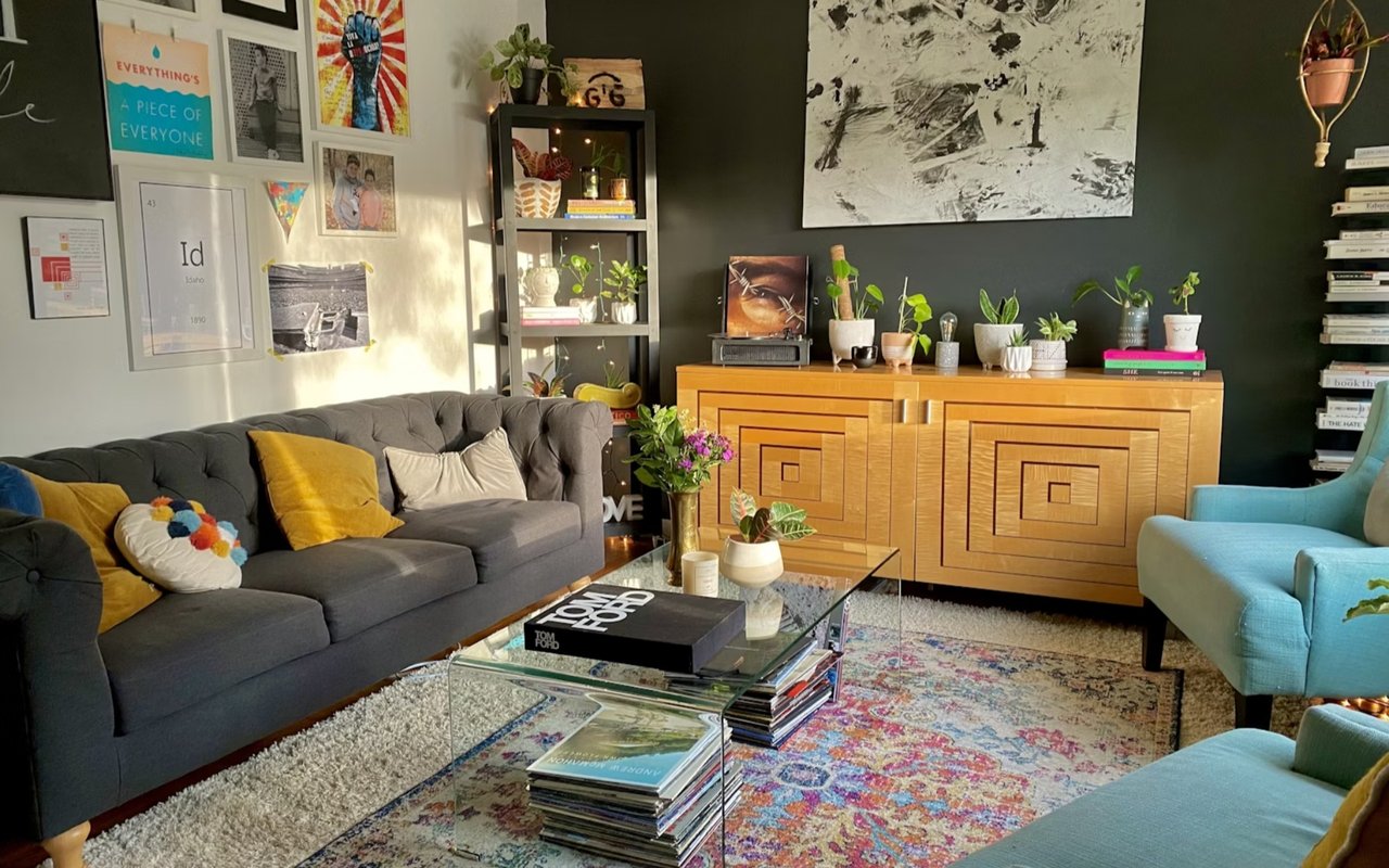
Room-by-Room Recommendations
Each room serves a unique purpose and deserves a tailored color strategy. For living rooms, warm neutrals or soft greens foster conversation and comfort. Kitchens benefit from sunny yellows or clean whites that evoke freshness and cleanliness. Bedrooms flourish with soft blues, lavenders, or earthy tones to encourage rest. Bathrooms often shine with spa-like palettes of seafoam green or pale gray. Offices perform best with muted greens or blues that promote concentration and reduce eye strain.
Ceiling and Trim Considerations
Ceilings and trim are often overlooked, but they significantly influence a room’s ambiance. A white ceiling creates height and openness, while a colored ceiling can add drama or intimacy. For trims, crisp whites or off-whites are traditional choices, but contrasting hues can highlight architectural details. Using a semi-gloss finish on trims and doors provides durability and subtle sheen, enhancing contrast with matte or eggshell wall finishes.
Neutrals as Foundational Elements
Neutral paint tones—such as greige, taupe, and soft white—serve as versatile backdrops that work across various design styles. They allow for flexibility with furniture, artwork, and seasonal décor. These hues also reflect light well, making them suitable for darker or smaller spaces. Neutrals don't have to be bland; choosing ones with subtle undertones (cool or warm) can add character while preserving a clean aesthetic.
Creating Flow Between Rooms
Open-concept layouts and adjacent rooms call for thoughtful transitions. While each space can have its distinct identity, cohesion is key. Selecting a base neutral to carry through the house and adding accent colors in specific rooms creates visual unity. Using similar undertones or variations of the same hue family ensures that the overall palette feels harmonious. This approach reduces visual jarring and enhances the sense of architectural and design continuity.
Testing and Sampling Techniques
Before committing to a paint color, real-world testing is critical. Paint swatches on paper often differ from how they appear on walls due to surface texture and lighting. Professionals recommend painting large sample patches on different walls in the room and observing them at various times. Some brands offer peel-and-stick samples that are mess-free and movable. Investing in this step can prevent costly repainting and ensures satisfaction with the final result.
Impact of Finish and Sheen
Paint finishes play a role in both aesthetics and function. Matte and eggshell finishes hide wall imperfections and create a soft look, suitable for low-traffic areas. Satin offers a slight sheen and is ideal for kitchens and bathrooms due to its cleanability. Semi-gloss and gloss finishes are durable and reflective, commonly used for trims, doors, and cabinetry. Choosing the right sheen enhances the chosen color while supporting the room’s usage.
Cultural and Personal Influences
Color preferences are also shaped by cultural backgrounds and personal experiences. For instance, red signifies good luck in some cultures but can feel aggressive in others. Similarly, personal associations—like a blue room from childhood—can influence how someone perceives a space. While color theory provides guidelines, it’s essential to blend this knowledge with personal taste and lifestyle to create a space that feels authentic and comfortable.
Environmentally Friendly Paint Choices
Today’s consumers increasingly prioritize sustainability in home design. Low-VOC (volatile organic compounds) and zero-VOC paints reduce harmful emissions, improving indoor air quality—especially important for nurseries and bedrooms. Many eco-friendly paints are now available in a wide range of colors and finishes without sacrificing performance. Brands like Benjamin Moore’s Natura and Sherwin-Williams Harmony offer durable, safe alternatives for environmentally conscious homeowners.
The Final Brushstroke
In the end, choosing the right paint color is both an art and a science. While guidelines rooted in color psychology, light behavior, and design theory provide direction, the ultimate goal is to create spaces that reflect the people who live in them. Testing, personal preference, and practicality must all converge. With an informed approach and an eye for harmony, any homeowner can craft a palette that turns their house into a haven.
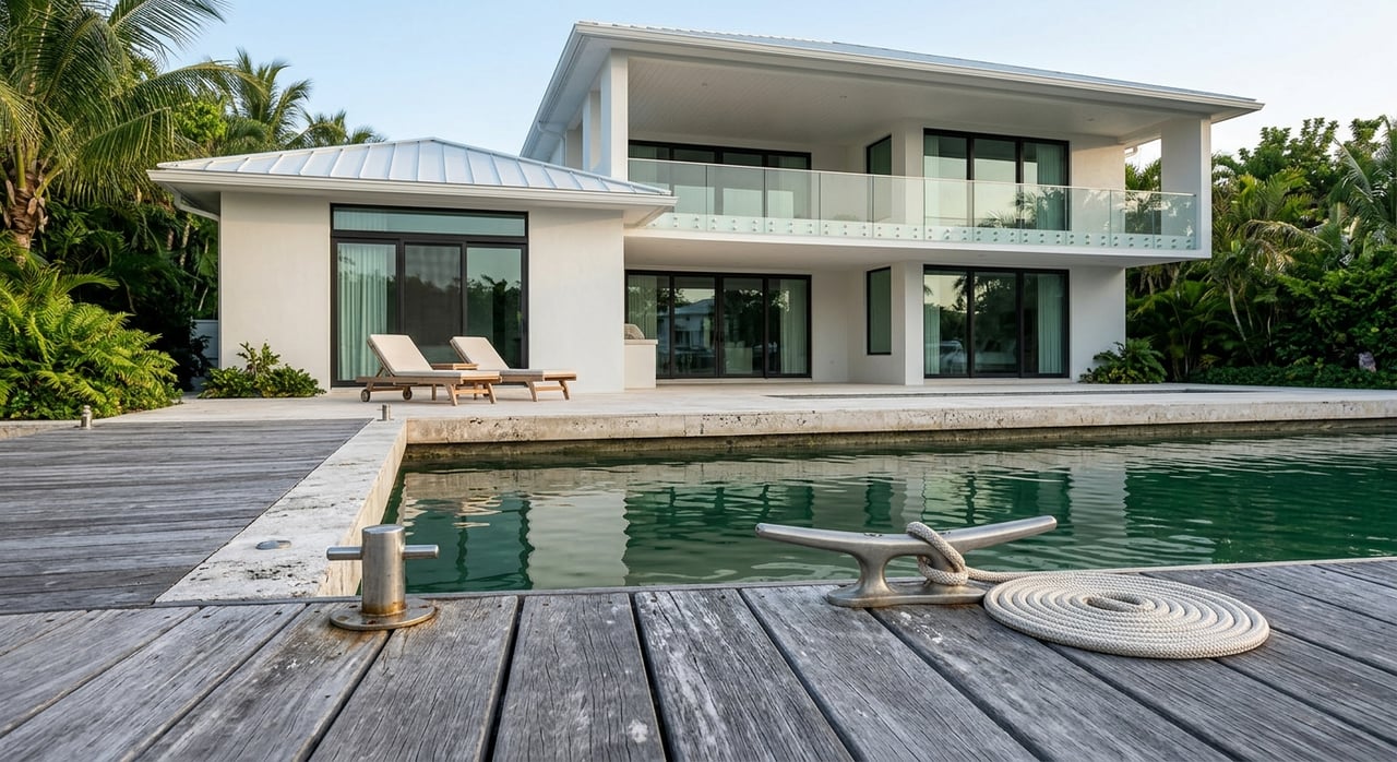
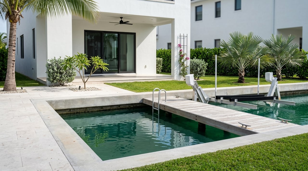
Bring Your Vision to Life in The Bahamas
For homeowners seeking to enhance their living spaces or prepare properties for sale, The Agency Bahamas offers the local insight and aesthetic expertise to make every room stand out. Their team understands the power of color in real estate—from setting a welcoming tone for showings to advising on paint palettes that photograph beautifully. Whether upgrading a primary residence or staging a luxury listing, The Agency Bahamas helps clients make color choices that truly elevate their spaces.